Maximum Sign Visibility: The Science of Font Size and Color Contrast
Most signs don’t fail because of poor design; they fail because they’re not readable fast enough. Whether someone is driving past or walking by, your message has only a few seconds to register. If it takes effort to read, it simply gets ignored.
That’s why sign visibility is the real measure of effective signage. It’s not about how creative your design looks up closely, but how clearly it communicates from a distance. The difference often comes down to two critical elements: a well-planned font size guide and the right use of contrast colors.
Font Size: Visibility Starts with Scale
One of the biggest mistakes in banner design is using text that’s too small. No matter how strong your message is, it won’t work if it can’t be seen from a distance.
A simple font size guide can help:
- 1-inch letter height ≈ 10 feet readability
- 4-inch letters ≈ up to 100 feet
- Larger text improves visibility in high-traffic areas
Instead of adding more words, focus on making your main message bigger and clearer. Strong scaling is essential for better sign visibility, especially for roadside and outdoor placements.
Sign Typography: Keep It Clear, Not Complex
When it comes to sign typography, simplicity wins every time. Decorative fonts may look appealing up close, but they often fail in real-world conditions.
To improve readability:
- Use clean, sans-serif fonts
- Avoid script or overly stylized text
- Keep spacing consistent and uncluttered
Clear sign typography ensures your message is understood instantly, even from a distance, without forcing the viewer to slow down or re-read.
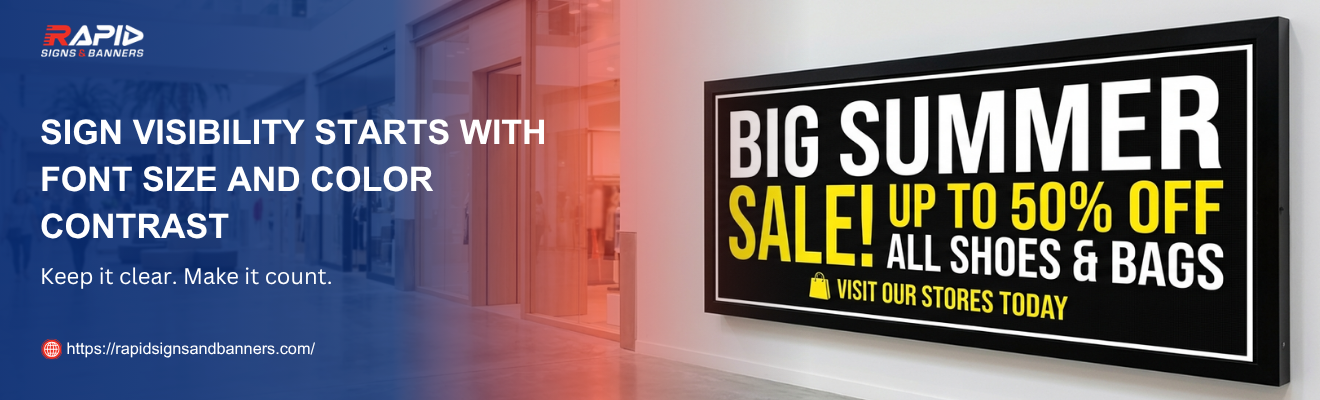
Contrast Colors: The Key to Instant Readability
Color plays a powerful role in how quickly your sign is understood. High contrast colors create separation between text and background, making your message stand out at a glance.
Some of the most effective combinations include:
- Yellow on black
- White on dark blue
- Black on white
These combinations work well across different lighting conditions, from bright daylight to low-light environments. Poor contrast, on the other hand, reduces clarity and directly impacts sign visibility, no matter how large the text is.
Designing for Maximum Impact
Strong signage is built on clarity, not complexity. When the right elements come together, your message becomes easy to notice and remember.
Keep these banner design tips in mind:
- Focus on one clear message
- Keep text short and bold
- Use size and contrast to guide attention
- Position key text at eye level whenever possible
Turn Visibility into Results
Effective signage doesn’t just attract attention — it drives action. By combining the right font size guide, clean sign typography, and high-impact contrast colors, you ensure your message performs in real conditions.
If you’re ready to improve your sign visibility with designs that truly deliver, expert support can make all the difference.
Ready to get started? Choose your size, upload your design, and place your order online or contact us for fast, professional printing.